Project Findings
Upon completion of the quantitative / qualitative databases and the following analysis on the body of text, we moved into the analysis stage of our project. This primarily involved making graphs to investigate the analysis of our model.
Through the analysis of the text and the creation of our visualizations, we made several noteworthy insights. The first thing we wanted to know was how often qualitative references were made in the body of text we scraped compared to quantitative. This means references to things like completions, carries and interceptions or quantitative references. Essentially raw stats from the players performance. For qualitative, things like leader, distraction or unprofessional were counted to capture how often the players personality or off the field actions were being referenced. We did this to get an understanding of where the media was typically framing these players, and we believed this would reflect how important off the field attributes were in reporting.
While we expected to find that the quantitative would be represented more in the text, what we found was a staggering difference. Qualitative traits were referenced less than 500 times in over 17000 articles, whereas quantitative references closed in on 4000. The media hardly cared about the qualitative traits a player has. This indicated to our group not that it isn’t important, but that there should be a bigger focus on the qualitative aspect of a player, and that something valuable could be overlooked in neglecting this.
We wanted to look at all of our findings from a high level before diving into each positional group. Here we can see the amount of articles for each player.
Here we can see that there is a lot of variability in the amount of articles each player has. This makes sense as the longer a player is in the NFL and the more success they have, the more articles there will be about them. The only criteria for a player to be included was having played 2 seasons post 2010. Some players could have played 10+ seasons where others only played 2. The data is highly skewed, and a small number of players dominate coverage. Many players simply do not have a lot of media coverage, and that media coverage is not evenly distributed which isn’t surprising. However, the middle tier of players seemingly have moderate coverage in the media. There was a concern that this implied our data was biased.
Our next visualization investigated that concern.
While some players have a lot more articles, the distribution of sentiment follows a general bell curve. This histogram uses 20 bins to depict the frequency of sentiment scores across our selected players. The data follows a normal distribution, centered around the mean of 0.06. This shows that while there are extreme lows and extreme highs the rest of our players sit in a “normal” baseline. This also shows that there are very few players that have exceedingly low sentiment scores, meaning our data was not extremely biased.
Furthermore, we analyzed each player’s total selected sentences across all the articles. As detailed in our behind the scenes section, we picked sentences from the body of text if the sentence had a match to the players full or last name, and if the sentence had a confidence level of .6 or higher. This box and whisker plot shows that most players fall into a normal range, and that we do have a fair amount of outliers.
This next scatterplot again shows a weak to positive relationship between the players sentiment and selected sentences from the body of text. More high variability, lots of outliers that are influencing the trend, but the data is more clusters. These graphs are implying that article volume is driving sentence count.
The next step was diving into the sentiment by player position.
While the difference isn’t massive, it does appear that there is a position based narrative being posed by the text. It seems that sentiment is not influenced purely by performance, but also by how that positional role is discussed in the media. Quarterbacks face high praise and criticism alike, so finding them on the lower side of this graph makes sense. This follows with running backs and receivers as they are high producing positions in football.
The last step in the high level analysis of the players was looking at the sentiment score for each player. We used a statistic designed by pro-football-reference.com called "Approximate Value” (AV). AV essentially groups players, regardless of their position, by their contribution to the team's overall success (detailed more in behind the scenes). This let us graph every player from our data pool under one normalized statistic to see how performance correlated to sentiment.
As you can see, there is a weak to positive correlation between these two variables. AV increases slightly as sentiment becomes more positive. However, there is clearly high variability, the points are spread out. This implies that sentiment does not necessarily explain player value from our data pool of players. Nevertheless, there is an upward trend, meaning a higher sentiment may mean a higher AV. The amount of outliers present certainly confirms that the data is noisy or biased however. There is a positive signal here, but we wanted to dive deeper into the position groups themselves and see what we found.
We started with QBs, and moved through each position group. The scatter plot shows how their media presence has a positive correlation with their on field performance by 45%. This suggests that positive media presence for the quarterback, generally, can lead towards higher passer ratings. The spread of dots (quarterbacks) indicates while passer rating and sentiment score are related there are still several outliers who perform well even with a lower sentiment score and vice versa, players with a higher sentiment score but lower pass ratings.
The scatter plot for the defensive linemen shows almost no correlation between the Defensive linemen sentiment score and average sacks statistic. There is a very weak positive correlation between the two, resting at about 7% correlation between the two variables. This suggests that the defensive linemen media coverage does not rely on how many sacks they have.
The Defensive Back scatterplot shows a negative correlation between a defensive back media performance and their performance on the field in pass deflections. A player with fewer pass deflections but higher sentiment scores could be key players if the opposing quarterback avoids throwing in their direction, which could indicate positive media coverage.
For tight ends, selecting the statistic was a little more tricky. Tight ends are used in both the pass and blocking game within football and so certain tight ends are better equipped for run-blocking while others are more of a receiving threat. In the end, I decided to use average receiving yards. The reason I chose this was at the end of the day, even though tight ends are a very flexible position, fan perspective and media perspective often comes from the flashy statistics, which in this case is receiving yards.
For running backs, selecting the statistic was fairly straightforward as rushing yards are the standard metric used to estimate a player's success.
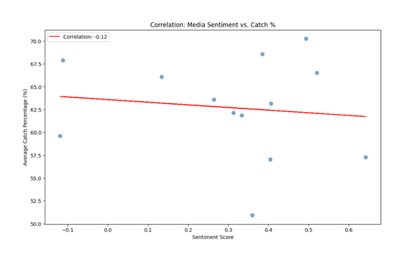
The findings here were somewhat of a mixed bag. The correlation value between rushing yards and sentiment score was 0.25. This is enough correlation to suggest that there may be a correlation, but not strong enough to decisively conclude that. With some players being outliers it is hard to definitely tell if there is a correlation here, but it did show something which is worth consideration.
This is where selecting the statistic became extremely tricky. Unlike positions that have meaningful stats recorded every game, offensive linemen really don’t. Their impact on the field is hard to measure with a single statistic. I worked through it logically and worked my way down to two different options: Average penalties and average snap percentage. The rationale behind penalties is that when an offensive linemen takes more penalties, it means that they are consistently getting beat by the player that they are attempting to block. However, they are not the perfect indicator as their actual success when not committing a penalty is omitted. Snap percentage looks at another aspect of offensive linemen that is viewed as important, availability. If an offensive linemen is consistently playing snaps it means that they are: a) Rarely injured b) Being started often. The problem here however is that most offensive linemen that are within our dataset will have a high probability of playing often, since they are represented in the media. I discussed it with the team and landed on making a chart for each statistic.
Looking first at snap percentage, the correlation sits at 0.08. This number of basically zero indicates that there is effectively no correlation between the snap percentage and media representation. This does not surprise me as most offensive linemen that have significant statistical presence in the NFL, will have a high snap percentage. This means that any type of player, positive or negative, will have around the same snap percentage. Penalties are a little more interesting but not by much. The correlation between penalties taken and sentiment score is -0.2. This is still a weak correlation and may not mean much, but I do believe that it is proof that penalties, if this research were to move forward, would be a better statistic to use than snap percentage.
The scatterplot depicts a positive relationship between media perception and combined tackles. We can see an extremely positive correlation at around 78%, implying that heavy tacklers have a favorable depiction in the media.
Media sentiment is a reliable proxy for performance in certain positions, but is heavily influenced by narrative and context in others, limiting its use as a universal evaluation metric. Essentially, this works, but only in the right context. It is position dependent but does give a reflection on how the media talks about players. We ultimately do a better job of capturing media bias and narrative rather than the players personalities and how that reflects their performance. We found that some positions like tight ends and linebackers are stat driven in the media whereas QBs, DBs and DL are more narrative driven. With the data we collected and analyzed from the pool of players we selected, it seems that sentiment is not a universal performance metric when derived from media sentiment.